Architect vs. Artist: Who Actually Drew the Century's Most Iconic Logo?
The Mexico 68 identity remains one of graphic design's most storied power struggles — a dispute that cuts to the core of what it means to own a creative idea.
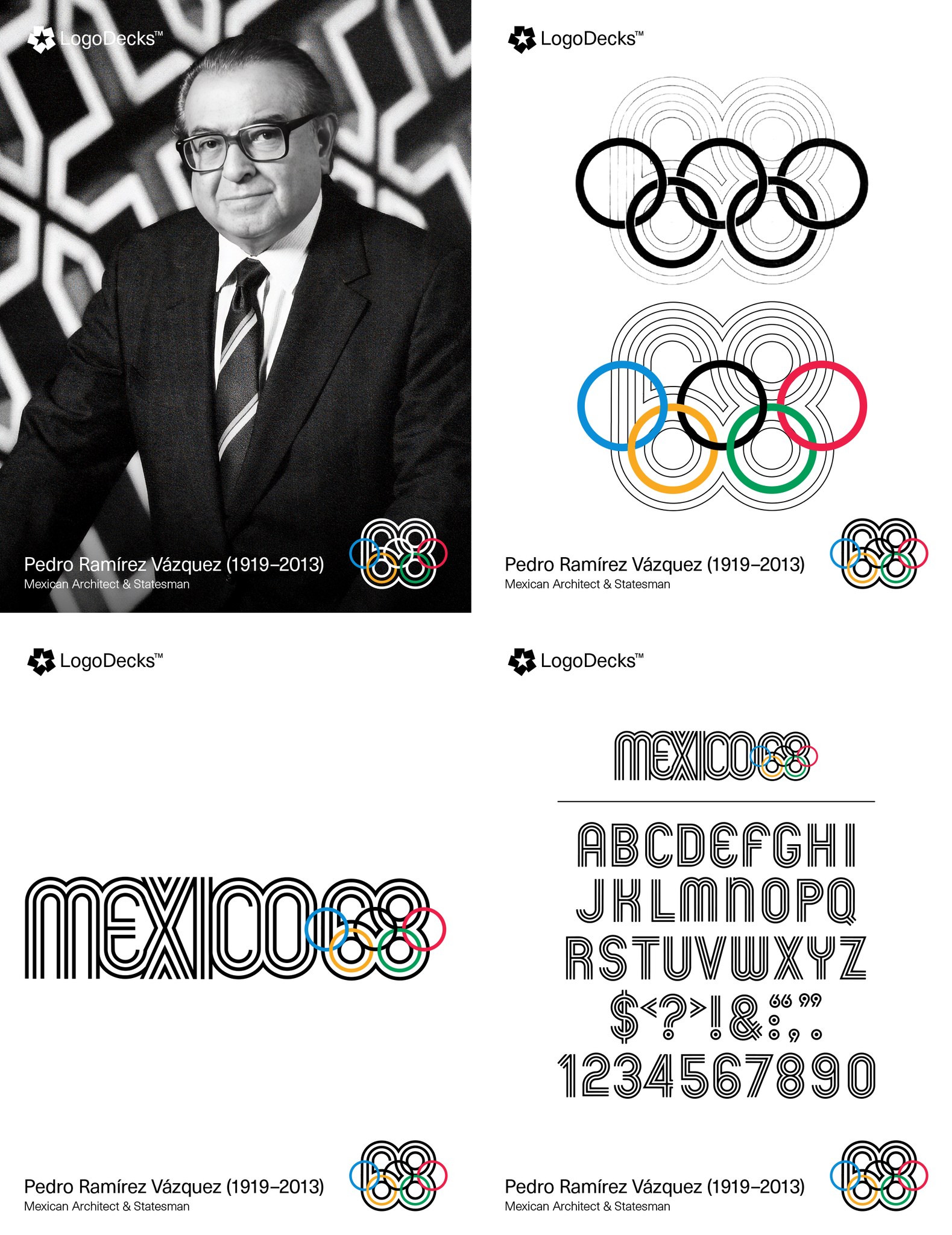
The creation of the Mexico 68 logo remains one of graphic design's most storied power struggles. While history often highlights American designer Lance Wyman for the technical execution of the radiating parallel lines, archival evidence and testimonies from the Organizing Committee strongly support Pedro Ramírez Vázquez as the conceptual architect.
As the Committee's President, Ramírez Vázquez rejected initial proposals as too "Western" and dictated the core vision: a fusion of the five Olympic rings with the digits "68." He sought to marry modern Op Art with the linear geometry of indigenous Huichol wax paintings, ensuring the identity was undeniably Mexican. The result became one of the most recognized visual systems in Olympic history — and one of the most disputed.
The Two Men at the Center
Understanding the dispute requires knowing who these two figures were — and what role each played in the creative chain.
Pedro Ramírez Vázquez (1919–2013) was a Mexican architect, statesman, and cultural director. As President of the Organizing Committee, he set the total visual identity brief. He rejected Western proposals and defined the requirement for indigenous visual language fused with Op Art geometry. His estate holds documents suggesting the core structure was already being prototyped under his direction before Wyman was even hired.
Lance Wyman (b. 1937) is the American graphic designer hired to give form to that brief. He arrived in Mexico City, produced the final "68" logotype, and built the comprehensive parallel-line system that extended across signage, uniforms, and wayfinding across the entire Games. He has maintained that his sketches birthed the logotype — a claim that has never been fully settled.
The Drama of Authorship
The friction between the two men stems from a fundamental clash over authorship versus collaboration. Wyman has long maintained that his arrival in Mexico City and subsequent sketches birthed the "68" logotype. Conversely, Ramírez Vázquez's estate has produced documents suggesting the geometry was already being prototyped under his strict direction before Wyman was even hired.
"Who holds the pen is a different question from who defines the idea. The Mexico 68 dispute is a masterclass in why that distinction matters."
This illustrates the tension between a visionary director who sets the "Total Look" and the talented designer who refines it. While Wyman provided the expert hand, it was Ramírez Vázquez's cultural authority and specific geometric instructions that ultimately defined the logo's soul — leaving a legacy of brilliance shadowed by a lifelong dispute over who truly held the pen.
What made this identity revolutionary
The logo's genius lies in what it fused: Op Art's kinetic energy (drawn from Bridget Riley and Victor Vasarely's visual movements), the Huichol tradition of repeated parallel lines in yarn paintings, and the blunt typographic confidence of mid-century Mexican modernism. No single designer from outside Mexico would have known to blend those three references. That cultural brief came from Ramírez Vázquez.
Yet Wyman's technical contribution is equally undeniable. The way the "6" and "8" lock into the ring system — borrowing the same stroke weight, sharing the same repeated-line grammar — required deep typographic intelligence and systematic thinking. The identity extended to over 1,000 applications across the Games. That execution belongs to Wyman.
Why This Matters to You as a Designer
This case is not just history. It is a live debate about the nature of creative ownership — one that becomes more relevant as you move from student to professional, from freelancer to creative director.
When a client gives you a detailed brief, structured references, and specific visual constraints — who owns the resulting work? When a creative director defines the concept and you execute it pixel-perfect — whose portfolio does it belong in? When a team delivers a winning campaign, who gets the headline credit?
The Mexico 68 story has no clean answer. But understanding why the dispute exists will sharpen how you communicate, contract, and credit work throughout your entire career.
Three Things Every Designer Should Extract From This Story
1. Document the brief. If you received specific visual instructions — color systems, cultural references, geometric constraints — keep them in writing. This is not paranoia; it is professional hygiene.
2. Distinguish concept from execution. Both have value. Learning to articulate which role you played — and which role your client or director played — is the difference between a confident portfolio and a credibility problem.
3. Cultural knowledge is a competitive advantage. Ramírez Vázquez brought indigenous Huichol visual language to an international stage because he understood it. Your design education — including the African Design System — gives you a perspective that no international hiring manager or foreign designer can replicate. That is not a small thing.
Published by Mindspark Online Courses (FZE) · Design History Series · For Working Professionals