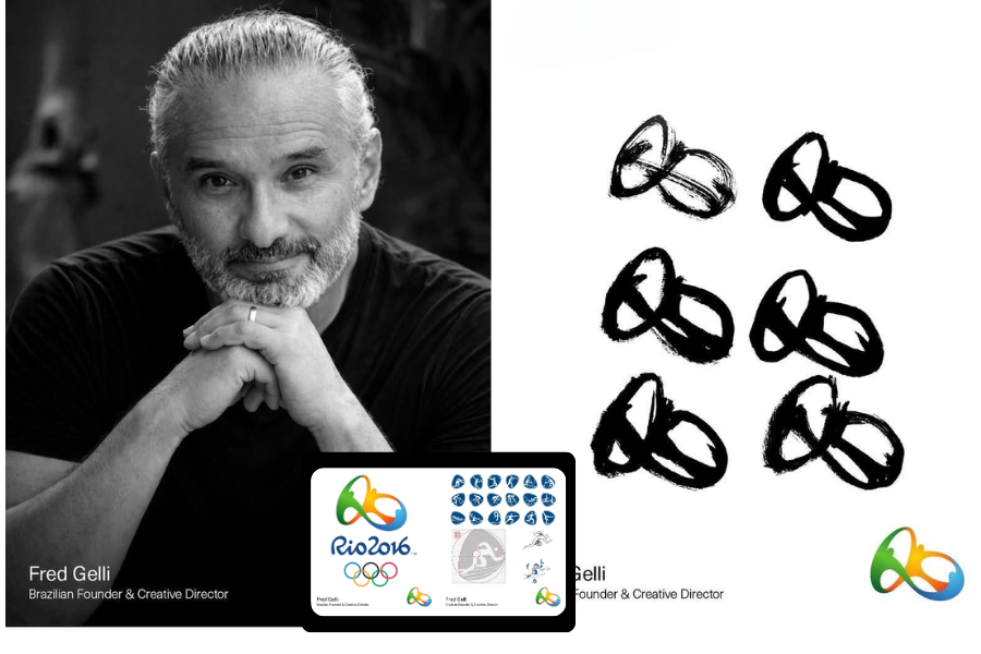
When the official identity for the 2016 Summer Olympics launched in 2010, the logo immediately stood out for its fluid, human-centered design. Created by Brazilian agency Tátil Design under the direction of Fred Gelli, the emblem was developed to reflect Rio de Janeiro’s energy, movement, and natural landscape while introducing a more emotional visual language for the Olympic Games.
Rather than relying on rigid geometry or national symbolism alone, the identity emphasized connection, celebration, and physical interaction. The result became one of the most recognizable Olympic logos of the modern era.
Key Takeaways
- The 2016 Summer Olympics logo was officially unveiled in 2010 ahead of the Games in Brazil.
- The emblem was developed by Tátil Design with creative direction from Fred Gelli.
- The symbol features three interconnected figures designed to represent unity, movement, and collective celebration.
- The logo became the first Olympic identity intentionally developed as a three-dimensional form for digital and physical applications.
- Custom typography for the wider visual system was developed with support from Dalton Maag to create a cohesive brand language.
A more human approach to Olympic branding
The Rio 2016 identity departed from the more rigid visual systems often associated with international sporting events. Instead of emphasizing symmetry and structure, the logo focused on organic movement inspired by Rio’s coastline, landscape, and culture.
The interconnected forms create a circular motion that suggests collaboration and shared experience. The flowing shapes were also designed to work dynamically across animation, signage, merchandise, environmental graphics, and broadcast media.
This flexibility was particularly important for a global event operating across physical venues, digital platforms, and international marketing campaigns simultaneously.
Building a scalable identity system
Beyond the central emblem, the project evolved into a complete visual ecosystem that included typography, color systems, motion principles, and environmental branding. The identity needed to remain recognizable across everything from mobile screens and athlete uniforms to stadium installations and international advertising.
The visual language emphasized warmth, accessibility, and movement while maintaining consistency across Olympic communications. By treating the logo as part of a broader adaptive system rather than an isolated mark, the design team created a flexible identity capable of functioning across multiple media environments.
The project also reflected a broader shift in global branding during the 2010s, where logos increasingly needed to perform in motion-based and digital-first contexts rather than static print environments alone.
What designers can learn from the Rio 2016 identity
- Strong event branding systems balance emotional storytelling with functional scalability.
- Organic forms can create a more approachable and human-centered identity.
- Motion and adaptability are essential components of modern logo systems.
- Cohesive typography and visual behavior strengthen recognition across platforms.
- Successful identities often prioritize long-term flexibility over decorative complexity.
Original article reference: Publicly available information regarding the visual identity development of the 2016 Summer Olympics.