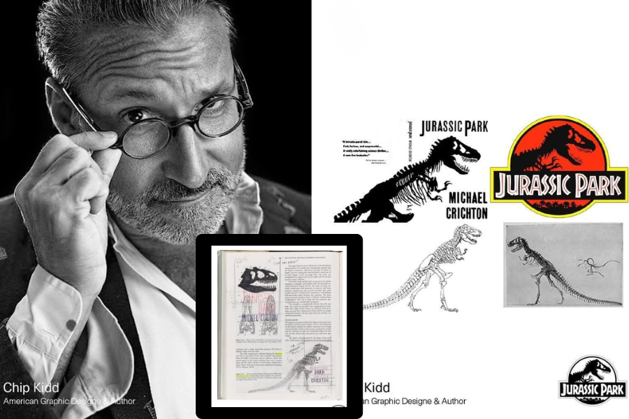
In 1990, graphic designer Chip Kidd created what would become one of the most iconic visual identities in modern entertainment. Originally designed for Michael Crichton’s novel Jurassic Park, the now-famous Tyrannosaurus rex silhouette evolved from a simple book cover concept into a global cultural symbol recognized across publishing, film, merchandise, and theme parks.
At just 26 years old and working at Alfred A. Knopf, Kidd was tasked with designing a cover that could visually communicate the novel’s central idea: the scientific resurrection of extinct creatures through genetic engineering. Rather than illustrating a living dinosaur in dramatic fashion, Kidd pursued a more restrained and conceptual direction rooted in science, anatomy, and minimalism.
Key Takeaways
- Chip Kidd designed the original Jurassic Park cover artwork at age 26 while working at Knopf in 1990.
- The iconic T. rex silhouette was traced from a fossil illustration found in Vertebrate Paleontology and Evolution by Robert L. Carroll.
- The original design used a stark black skeletal silhouette to reflect the novel’s themes of genetics, extinction, and scientific reconstruction.
- The visual identity later became the foundation for Jurassic Park, eventually appearing across films, merchandise, vehicles, and global marketing campaigns.
- Designer Sandy Collora later adapted the artwork for Universal Pictures by introducing the circular frame and tropical landscape details now associated with the franchise logo.
A design solution rooted in scientific storytelling
Rather than relying on conventional movie-style illustration, Kidd focused on creating a visual system that reflected the intellectual tone of Crichton’s writing. During the concept development phase, he visited the American Museum of Natural History searching for reference material that felt authentic and scientifically grounded.
His breakthrough came after discovering a Tyrannosaurus rex skeleton illustration in Vertebrate Paleontology and Evolution. Kidd traced the fossil structure and transformed it into a bold black silhouette that resembled an X-ray or scientific specimen rather than a living creature. The result immediately communicated extinction, anatomy, and resurrection in a single image.
The typography reinforced the concept further. Kidd paired the skeletal mark with rugged display lettering using the Neuland Inline font, creating a raw, primal visual language that contrasted against the clean scientific undertones of the skeletal illustration.
From book cover to global entertainment icon
What began as a publishing design solution quickly expanded beyond literature. According to Kidd, Michael Crichton immediately approved the concept, reportedly calling the final design “fucking fantastic.” The response validated the power of restraint and conceptual clarity in visual storytelling.
When Universal Pictures adapted Jurassic Park into a feature film in 1993, the silhouette became the centerpiece of the franchise’s branding system. The logo was refined for cinematic use, with additional environmental framing elements introduced by Sandy Collora, including the now-famous circular border and palm tree silhouettes.
The mark soon appeared across every aspect of the franchise ecosystem: film posters, park vehicles, merchandise, apparel, toys, and promotional campaigns. More than three decades later, the logo remains largely unchanged — a rare achievement in entertainment branding and a testament to the strength of the original concept.
What designers and creatives can learn from Chip Kidd’s approach
- Strong visual identities often emerge from conceptual clarity rather than excessive complexity.
- Research-driven design can create deeper emotional and intellectual resonance with audiences.
- Minimalist execution can produce stronger long-term brand recognition than trend-based styling.
- Typography and symbolism become significantly more powerful when aligned with narrative themes.
- Timeless branding frequently originates from simple, adaptable forms with strong storytelling foundations.
Original article reference: LogoDecks™ feature on Chip Kidd and the creation of the Jurassic Park visual identity.